Visual Embedded Analytics in Your Software
 Can of Worms
What do the numbers mean to you and your practice?
Opening your own practice means opening a whole new can of worms. That’s because there are so many elements that they don’t teach you about in school: aspects of running a business that you’re left to learn on the fly — all while attempting to provide quality care for your patients.
One of the most critical components of achieving practice success is making sense of the numbers. There are numbers everywhere, from revenue to no-shows, from patient visits to accounts receivable.
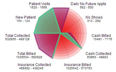
Radar chart — Visually resembling a spiderweb, the radar chart shows multiple variables on axes starting from the same point, radiating outward like spokes on a wheel. The length of the spoke is proportional to the magnitude of the data. This allows you to examine the correlation of values — say, accounts receivable and NFAs — that aren’t otherwise measured in comparable units.
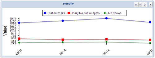
 Histogram — With a histogram, you can choose three charts to show you a graphical representation of a single area of your practice over a given time period (weekly/monthly), depending on the selection. This allows you to gauge how your practice is doing comparatively for a set amount of time.
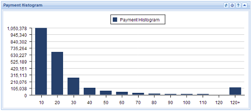
Billing Stats Report — This type of report allows you to view claims by date of service. The report can then be broken down in a number of different ways, depending on what you’re looking for (customizable by practice). The Billing Stats Report, or BSR, is very useful for digging into problems.
Ultimately, it’s up to you to determine which numbers provide the best snapshot of practice success; however, analytics are the tools that help bring that snapshot into focus.


 Certified by the New Jersey Department of Banking and Insurance